UX/UI Jan 2026
Zevo
Designing the world's first peer-to-peer EV sharing platform — where electric vehicle owners earn passive income by sharing contactlessly.
Overview
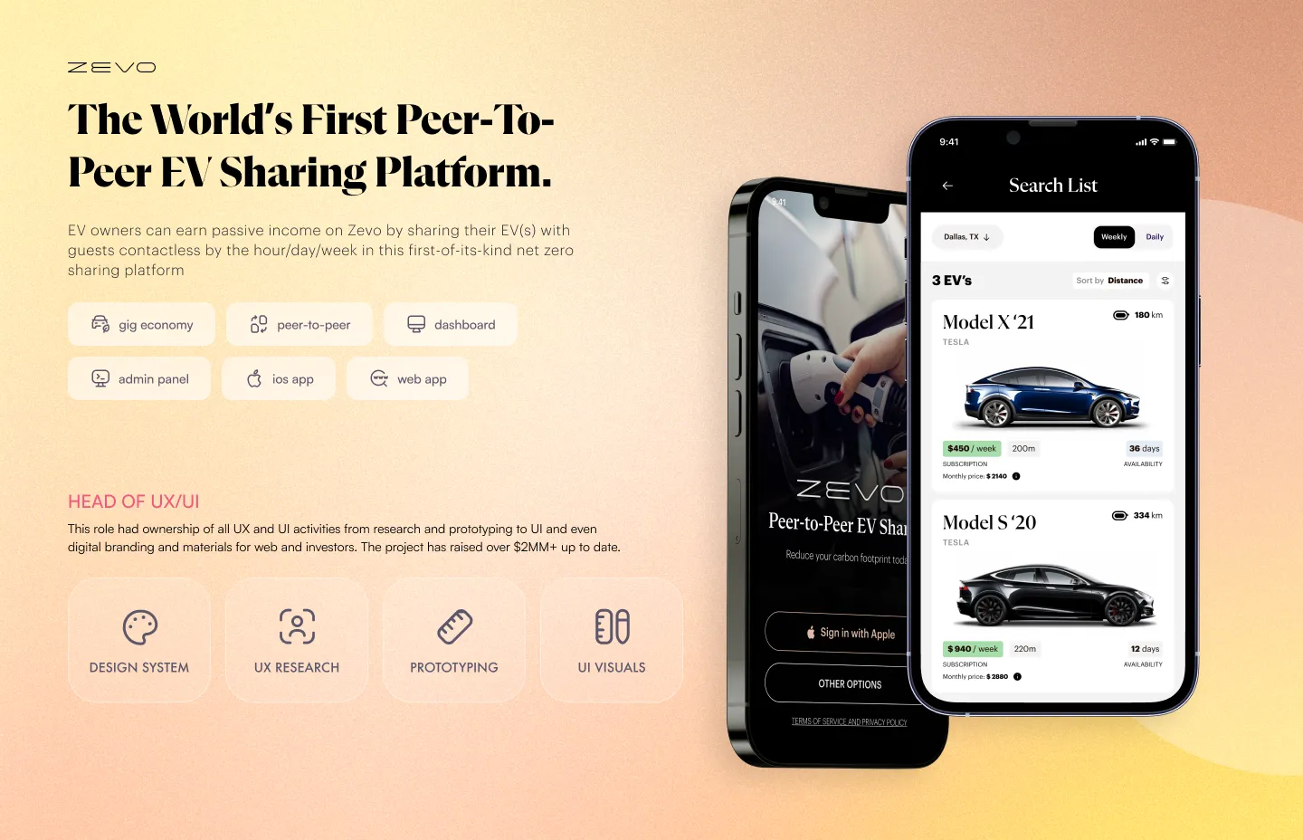
Zevo is the world’s first peer-to-peer EV sharing platform. EV owners list their vehicles and earn passive income while they sit idle. Guests book and unlock them contactlessly — by the hour, day, or week. No keys. No handoffs. No middlemen.
The startup raised a pre-seed round of $2M+. I led UX/UI design end-to-end at Digihey, Zevo’s Croatian development partner, owning every major design decision from research through prototype.
The honest framing of this project: it’s a fintech problem wearing a mobility skin. Real money moves on every trip — owner earnings, guest payments, security deposits, dynamic pricing, payout schedules, insurance coverage. The car is the asset, but the product is a two-sided marketplace built on trust and money flow. I designed it as such.
Context — the problem
Two strangers, one expensive vehicle, no human in the loop. That’s the situation Zevo has to make feel safe — and it has to feel safe to two different people at once.
An owner is handing a $40,000 asset to someone they’ve never met, expecting it back charged, undamaged, and on time, with money in their account afterward. A guest is paying upfront to unlock a car they can’t yet see, on the promise that it’s where the app says it is, charged to the level listed, and that the unlock will actually work when they’re standing in a car park with luggage.
If either side’s confidence breaks — a payout that doesn’t arrive, a deposit that feels arbitrary, a car that’s at 30% when the listing said 80%, an unlock that spins — they don’t just churn. They tell people the platform can’t be trusted. In a marketplace, that’s existential. So the design problem wasn’t “make a nice booking app.” It was: engineer trust into every point where money or control changes hands, on both sides, without a human there to smooth it over.
Research & discovery
I researched both sides as distinct populations with distinct anxieties, because they are.
I mapped the existing mental models people already carry into this — ride-hailing (Uber/Bolt), traditional car rental, and the closest analogues in P2P (Turo, Getaround) and short-stay marketplaces (Airbnb’s trust mechanics around deposits, reviews, and host/guest symmetry). The point wasn’t to copy any of them; it was to find which conventions users already trust so I could borrow that trust, and which conventions actively break trust so I could avoid them. Rental-counter friction and opaque “you’ll be charged later” fees were the clearest anti-patterns.
The most useful discovery work was failure-mode mapping rather than feature listing. I went looking for the moments where the contactless model has no fallback — the car isn’t there, the app loses signal mid-unlock, the charge is lower than listed, the previous guest returned it dirty or late, a deposit needs to be held and then released. Every one of those is a trust rupture and a money question at the same time. Those moments became the spine of the design, not edge cases bolted on at the end.
Information architecture & user flows
The platform is two products sharing one system. I designed the owner experience and the guest experience separately, then deliberately stress-tested the seams where they intersect — the handoff, the money, the reviews.
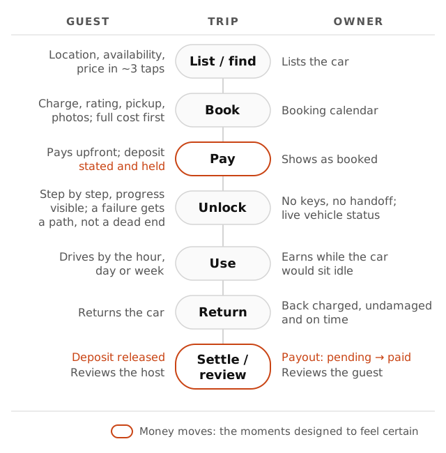
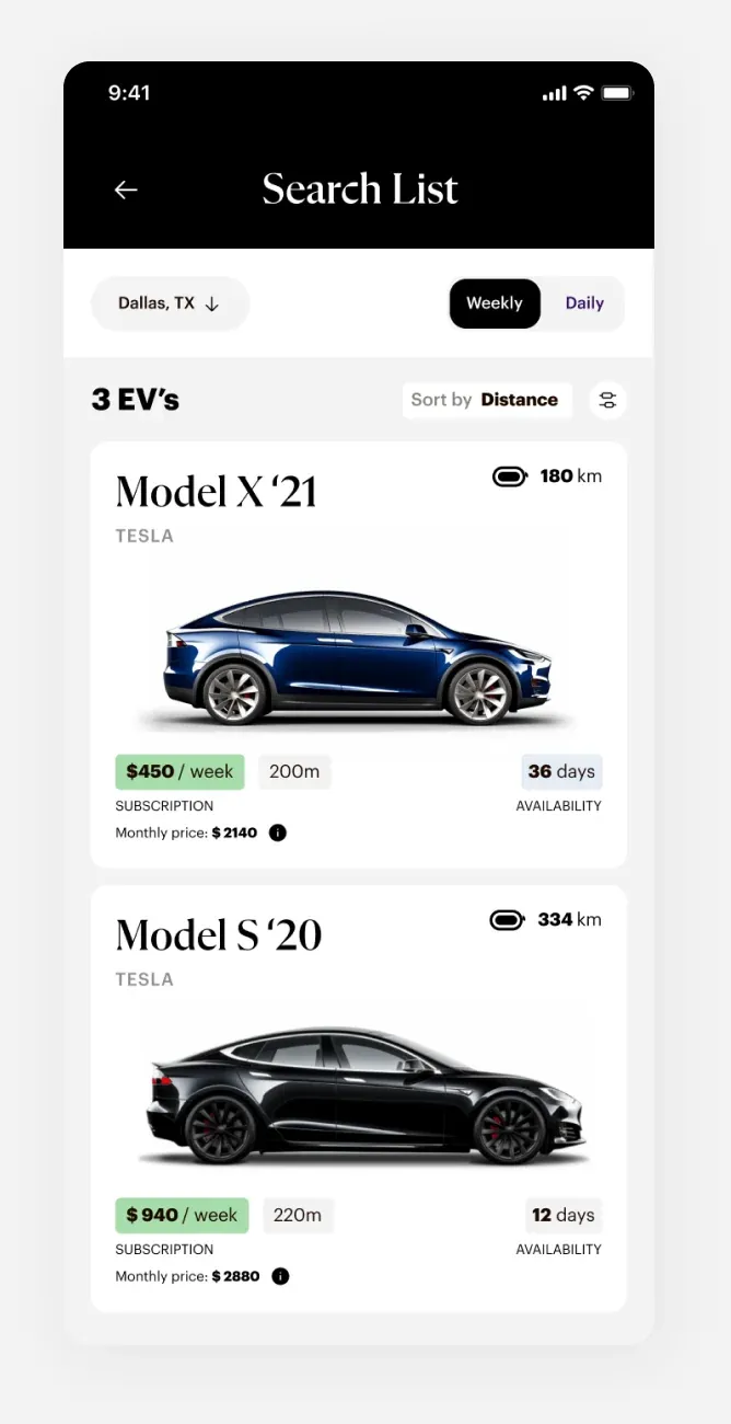
Guest flow mirrors the best of ride-hailing: location, availability, and price resolved in roughly three taps. The vehicle detail page is sequenced as a confidence-builder — the order of information is the design. Charge level, host rating, exact pickup location, and photos from multiple angles lead, because those are the four things a guest is actually anxious about. Price and the full cost breakdown (rental + deposit + any fees) sit where the user expects them, stated plainly, before commitment — no surprise totals at the end.
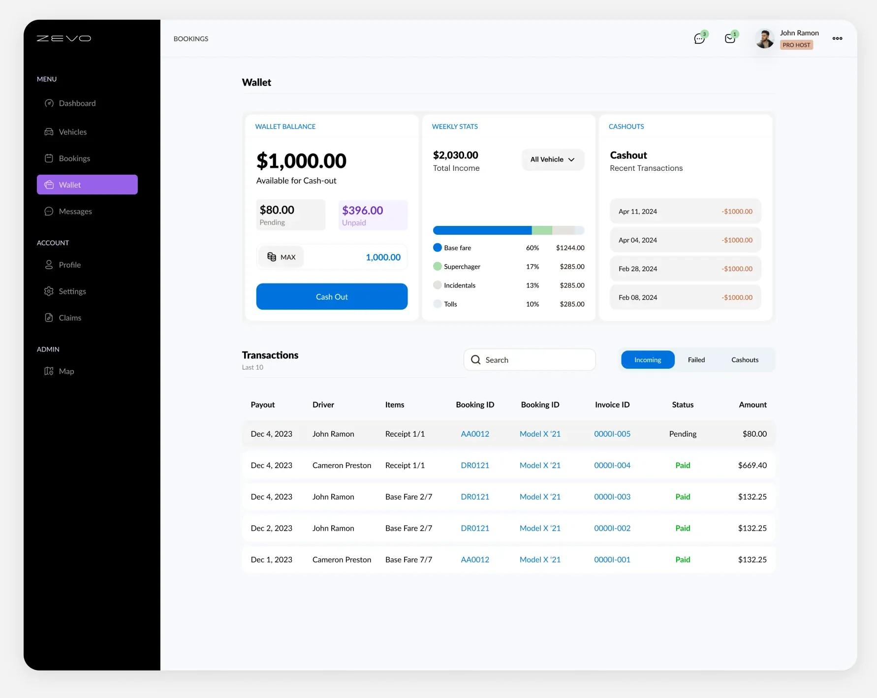
Owner flow leads with earnings, because that’s the owner’s entire reason for being there. The dashboard surfaces what’s at stake and what’s incoming: current vehicle status, the booking calendar, payout history, and next payout. The IA treats passive income as the home screen, not a buried report.
The shared spine is the trip lifecycle — list/find → book → pay → unlock → use → return → settle/review. I designed it as one continuous flow seen from two sides, so an action on the owner side always has a legible consequence on the guest side and vice versa.
Key decisions & trade-offs
This is the part that mattered most, and where the diagnosis and the calls I made actually live.
The contactless unlock — linear over flexible. This is the single highest-stakes moment in the product and the one most tempting to make “elegant.” I deliberately rejected a slick one-tap unlock in favour of a linear, step-by-step sequence where progress is always visible and every state has a defined next action. The trade-off: a few more taps and a less magical-feeling moment. The reason: a one-tap unlock is wonderful when it works and catastrophic when it doesn’t — and it gives the user nothing to do when it fails. The stepped flow trades a little delight for certainty. I tested it against the real anxiety points — car not present, lost connection, charge lower than listed — and made sure each had a clear, in-product path rather than a dead end and a support number. In a contactless model with no human present, recoverability beats elegance every time. That was the call.
Money has to feel certain before it feels generous. On the owner side, the instinct is to lead with a big projected-earnings number. I resisted over-promising. Earnings lead the dashboard, but they’re framed against real, legible status — what’s booked, what’s paid, what’s pending payout — so the income feels true rather than aspirational. An owner who is shown an inflated number once and a smaller payout later loses trust in the platform’s accounting, which is worse than under-promising. The trade-off was a less hype-y dashboard in exchange for a credible one.
Deposits and trust, surfaced not hidden. Security deposits are the friction point everyone wants to bury. I made the opposite call: state the deposit, the hold, and the release clearly and early on the guest side. Hiding it converts slightly better in the moment and erodes trust the instant the hold appears on a card. Transparency on money is a feature, not a tax — and in a trust marketplace it’s load-bearing.
Two products, one system — designed apart, validated together. I could have built a single shared interface with role toggles to save effort. I chose to design owner and guest as genuinely separate experiences, because their goals, vocabulary, and anxieties don’t overlap enough to share screens honestly. The cost was more design surface and a shared system to keep coherent. The payoff was that neither side felt like an afterthought bolted onto the other’s app.
Systems & craft
Two native platforms, two user types, one coherent system. I designed full UI for iOS and Android, which meant a component and token system that holds up across platform conventions without fragmenting the brand.
The harder craft work was state coverage. A money-and-trust marketplace lives in its edge states: pending payouts, held deposits, failed unlocks, lower-than-listed charge, late returns, connection loss. I treated those as first-class screens with designed empty / error / in-progress states, not afterthoughts — because in this product the edge state is the trust moment. Interactive prototypes carried the system into usability testing and into investor presentations, where the contactless-unlock flow had to be convincing to the people deciding whether to fund the whole thesis.
Outcome
Zevo launched a new category in sustainable mobility — turning idle EVs into earning assets and giving guests affordable, zero-emission transport on demand. The design made both sides of a two-sided money flow feel effortless and trustworthy: an owner who can see their income is real, and a guest who can walk up to a stranger’s car and get in without a phone call. The contactless unlock — the riskiest moment in the journey — became the thing the product is confident about rather than the thing it apologises for.
Key screens
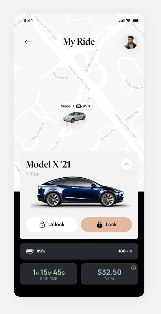
Flow / diagram