UX/UI May 2020
Samsung eShop
Designing and managing a brand new webshop for the Croatian market — complex ERP/CRM integration with independent pricing control.
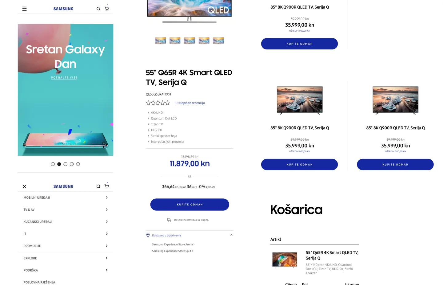
Overview
Samsung Croatia appointed our team to build their official Croatian webshop from scratch. The platform had to sit on top of our existing ERP and Samsung’s CRM simultaneously — while giving Samsung full, independent control over pricing, promotions, and catalog management.
Two separate systems of record. One seamless storefront. Premium brand expectations throughout.
Context — the problem
The brief had two halves that pulled in different directions, and the design had to absorb the tension between them so the customer never felt it.
On one side, an integration reality: stock data lived in our ERP, while pricing and catalog ownership lived with Samsung’s CRM. Neither side would give up operational autonomy, and both had to be reconciled in real time. On the other side, a brand reality: this is Samsung, so the experience had to meet a global standard while being localised for the Croatian market and tuned for conversion. The customer doesn’t care that two systems of record disagree about who owns the price — they just want an in-stock product at a clear price that arrives. My job was to make the storefront hold a single, premium truth on top of a split backend.
Research & discovery
Two tracks ran in parallel, because I owned both the project and the design.
The systems track was discovery into the integration itself — understanding exactly which system was authoritative for what (ERP for stock, Samsung CRM for pricing/catalog), where they could disagree, and what the storefront had to do when they did. That shaped the design as much as any user insight: a product page is only as trustworthy as the stock and price behind it, so I had to design for the seams, not just the happy path.
The conversion track was competitive analysis of the electronics-retail category — how considered purchases actually get made, where comparison happens, and where checkouts lose people. Electronics is a high-consideration, spec-driven purchase: people compare, they read specs, they hesitate. I catalogued the abandonment points common to the category so they could be designed out at the structural level rather than patched later. I validated mobile layouts against Samsung’s own analytics rather than assumptions, since the brand had real data on how its Croatian audience behaved.
Information architecture & user flows
The product page is the centre of gravity — Samsung’s most critical conversion surface — so the IA started there. Key specifications surface upfront rather than hiding inside expandable panels, because for a spec-driven purchase the specs are the content, and making someone click to find them adds friction exactly where they’re deciding. Comparison functionality was built in to support the considered purchases that define electronics retail; people don’t buy a TV without putting it next to another TV.
The checkout was stripped to essentials — every step carrying a single decision. The flow was shaped by the competitive abandonment analysis: known drop-off points were designed out of the structure rather than patched after launch.
Underneath both, the IA had to stay honest to the split backend — stock-aware from the ERP, price- and catalog-aware from Samsung’s CRM — so the front-end always reflected a single coherent state to the shopper.
Key decisions & trade-offs
One storefront truth over backend convenience. The path of least resistance is to let the front-end mirror whatever each system says and let the customer sort out the discrepancies. I refused that — the storefront had to present one coherent state (in stock, this price, buy now) regardless of which system owned which fact. The cost was more careful design and coordination across server, application, and frontend teams to reconcile ERP and CRM in real time. The reasoning: every visible inconsistency on a premium brand’s store is a small credibility leak, and Samsung’s bar didn’t allow for it.
Specs upfront over a tidier page. Hiding specs in expandable panels makes a cleaner-looking product page. I chose to surface key specs immediately instead, accepting a denser layout, because for a considered electronics purchase the buyer is there for the specs and hiding them is friction disguised as elegance. Cleanliness lost to decisiveness on the one surface where decisiveness converts.
Design out abandonment instead of patching it. Rather than ship a conventional checkout and optimise it post-launch, I used the competitive analysis to remove known abandonment points from the structure before launch. The trade-off was more design and analysis effort upfront against a constrained timeline. The payoff was a checkout that didn’t need rescuing.
Mobile-first validated against real data. Responsive wasn’t an afterthought layer — I designed mobile-first and validated those layouts against Samsung’s own analytics, then adapted up to tablet and desktop. The discipline was refusing to treat any breakpoint as the “real” design with the others as compromises.
Systems & craft
I carried dual responsibility as project manager and lead UX designer, accountable for the full scope — full UX/UI design and prototyping across desktop and mobile, managing development teams across server infrastructure, the webshop application, and frontend, and owning the project plan, timeline, and budget. I presented design solutions directly to Samsung stakeholders and incorporated their feedback into the work.
The craft demand was brand-grade systems thinking: a component and layout system that holds Samsung’s global standard while localised for Croatia, and that stays coherent across two systems of record feeding one storefront. The system had to be premium and honest to a complicated backend at the same time.
Outcome
The webshop launched as Samsung’s official Croatian e-commerce presence — handling the full product catalog, ERP-driven stock feeds, and Samsung-controlled pricing in a single, integrated platform. A clean delivery on a technically constrained brief: a premium, conversion-tuned storefront that presented one coherent truth to the shopper while two systems of record kept their independence behind it.