Hive3
Designing a Web3 education platform that makes blockchain learning accessible and engaging for newcomers.
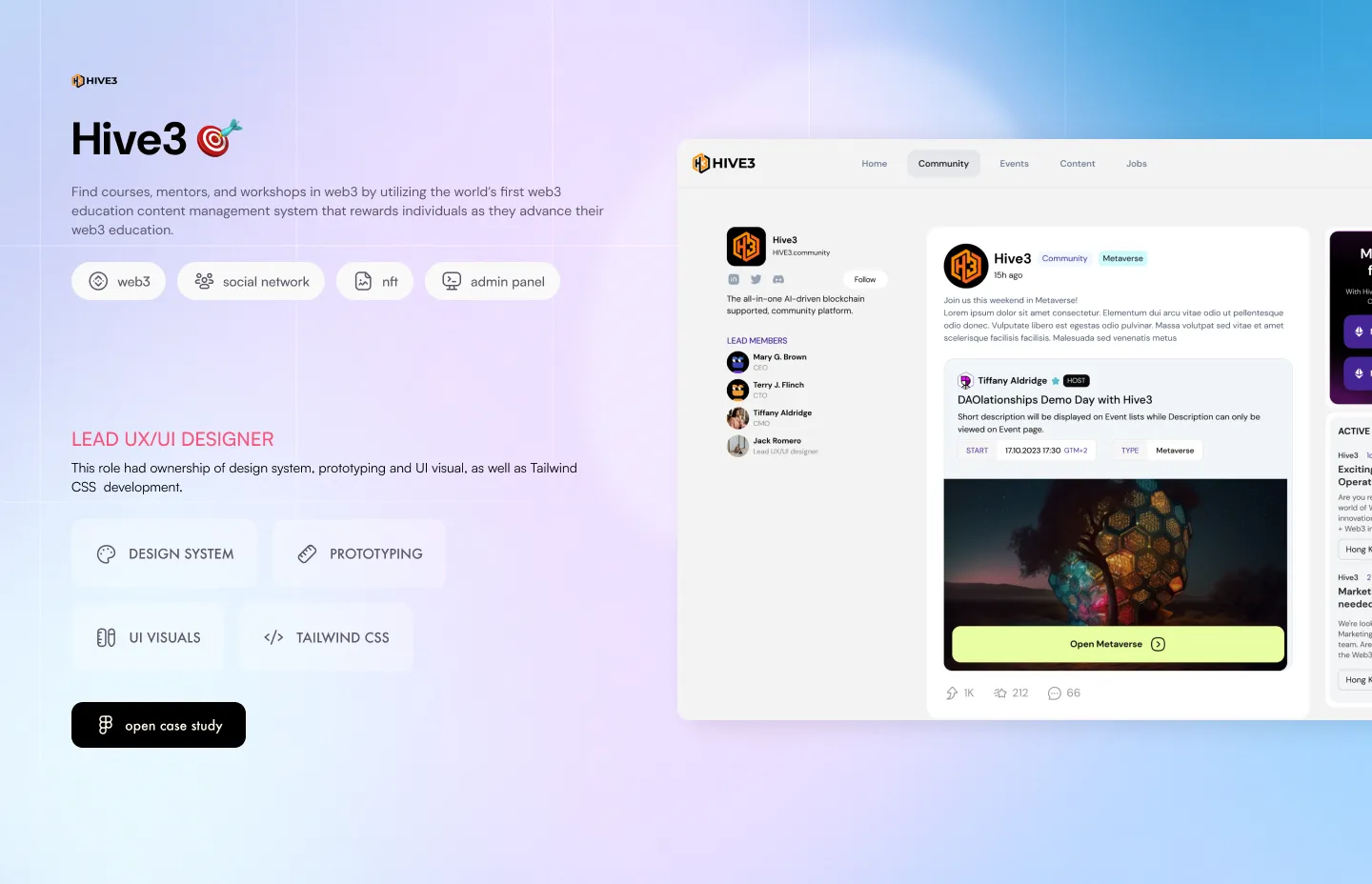
Overview
Hive3 is a Web3 education platform built for people who don’t yet speak the language. The product’s job is to take someone from zero blockchain knowledge to confident participation — without losing them to jargon or interface complexity along the way.
The Challenge
Web3 education has a drop-off problem. The concepts are genuinely hard, and most platforms either dumb them down to uselessness or front-load so much technical depth that learners bounce before they start.
The real challenge wasn’t content — it was pacing. How do you teach wallets, keys, gas, consensus, and tokenomics in a sequence that builds understanding rather than anxiety? And how do you design an interface that signals “you can do this” at every step?
Process
Research came first. I mapped learning journeys across distinct user types: curious beginners with no crypto context, traditional developers making the jump to Web3, and existing crypto users who’d never gone deep on fundamentals.
Each persona had a different entry point, a different pace, and a different vocabulary. The information architecture had to accommodate all three without fragmenting the experience into separate products.
From there, progressive disclosure became the organising principle — not as a UI pattern, but as a curriculum design philosophy applied to the interface itself.
Key Decisions
Complexity signalled visually, not verbally. Each module carries a visual indicator of depth. Users know before they click whether they’re about to read a three-minute primer or a technical deep-dive. Expectations set, drop-offs reduced.
The interface advances with the learner. Early modules present a stripped-back UI. As users progress, the platform introduces more advanced navigation options and tooling — mirroring the growing sophistication of the content. The product becomes more capable as the user does.
No jargon without scaffolding. Every technical term introduced in content has a tooltip or linked explainer. The glossary isn’t a separate section — it’s woven into the learning surface.
Outcome
Post-launch, course completion rates significantly outperformed comparable platforms. The design proved its thesis: if the interface earns trust at every step, learners stay.